| Day | Section | Topic |
|---|---|---|
| Mon, Aug 25 | 1.2 | Data tables, variables, and individuals |
| Wed, Aug 27 | 2.1.3 | Histograms & skew |
| Fri, Aug 29 | 2.1.5 | Boxplots |
Today we covered data tables, individuals, and variables. We also talked about the difference between categorical and quantitative variables.
In the data table in the example above, who or what are the individuals? What are the variables and which are quantitative and which are categorical?
If we want to compare states to see which are safer, why is it better to compare the rates instead of the total fatalities?
What is wrong with this student’s answer to the previous question?
Rates are better because they are more precise and easier to understand.
I like this incorrect answer because it is a perfect example of bullshit. This student doesn’t know the answer so they are trying to write something that sounds good and earns partial credit. Try to avoid writing bullshit. If you catch yourself writing B.S. on one of my quizzes or tests, then you can be sure that you a missing a really simple idea and you should see if you can figure out what it is.
Today we did our first in-class workshop:
Before that, we talked about how to summarize data. We talked briefly about making bar charts for categorical data. Then we used the class data we collected last time to introduce histograms and stem-and-leaf plots (also known as stemplots).
We talked about how to tell if data is skewed left or skewed right. We also reviewed the mean and the median.
The median of numbers is located at position .
The median is not affected by skew, but the average is pulled in the direction of the skew. So the average will be bigger than the median when the data is skewed right, and smaller when the data is skewed left.
We finished by talking about these examples.
Which is greater, the mean or the median household income?
Can you think of a distribution that is skewed left?
Why isn’t this bar graph from the book a histogram?
Until recently, Excel did not have an easy way to make histograms, but Google Sheets does. If you need to make a histogram, I recommend using Google Sheets or this histogram plotter tool.
We introduced the five number summary and box-and-whisker plots (boxplots). We also talked about the interquartile range (IQR) and how to use the rule to determine if data is an outlier.
We started with this simple example:
An 8 man crew team actually includes 9 men, the 8 rowers and one coxswain. Suppose the weights (in pounds) of the 9 men on a team are as follows:
120 180 185 200 210 210 215 215 215Find the 5-number summary and draw a box-and-whisker plot for this data. Is the coxswain who weighs 120 lbs. an outlier?
| Day | Section | Topic |
|---|---|---|
| Mon, Sep 1 | Labor day - no class | |
| Wed, Sep 3 | 2.1.4 | Standard deviation |
| Fri, Sep 5 | 4.1 | Normal distribution |
Today we talked about robust statistics such as the median and IQR that are not affected by outliers and skew. We also introduced the standard deviation. We did this one example of a standard deviation calculation by hand, but you won’t ever have to do that again in this class.
11 students just completed a nursing program. Here is the number of years it took each student to complete the program. Find the standard deviation of these numbers.
3 3 3 3 4 4 4 4 5 5 6From now on we will just use software to find standard deviation. In
a spreadsheet (Excel or Google Sheets) you can use the
=STDEV() function.
Which of the following data sets has the largest standard deviation?
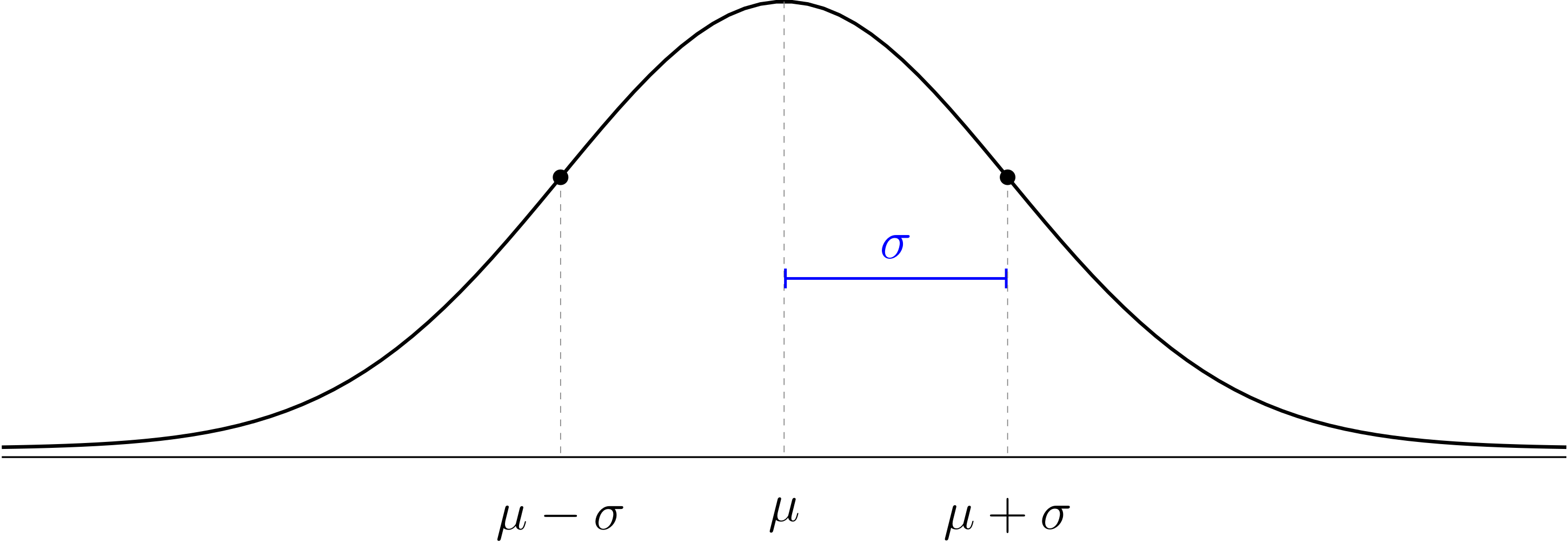
We finished by looking at some examples of histograms that have a shape that looks roughly like a bell. This is a very common pattern in nature that is called the normal distribution.
The normal distribution is a mathematical model for data with a histogram that is shaped like a bell. The model has the following features:
The normal distribution is a theoretical model that doesn’t have to perfectly match the data to be useful. We use Greek letters and for the theoretical mean and standard deviation of the normal distribution to distinguish them from the sample mean and standard deviation of our data which probably won’t follow the theoretical model perfectly.
We talked about z-values and the 68-95-99.7 rule.
We also did these exercises before the workshop.
In 2020, Farmville got 61 inches of rain total (making 2020 the second wettest year on record). How many standard deviations is this above average?
The average high temperature in Anchorage, AK in January is 21 degrees Fahrenheit, with standard deviation 10. The average high temperature in Honolulu, HI in January is 80°F with σ = 8°F. In which city would it be more unusual to have a high temperature of 57°F in January?
| Day | Section | Topic |
|---|---|---|
| Mon, Sep 8 | 4.1.5 | 68-95-99.7 rule |
| Wed, Sep 10 | 4.1.4 | Normal distribution computations |
| Fri, Sep 12 | 2.1, 8.1 | Scatterplots and correlation |
We introduced how to find percentages on a normal distribution for locations that aren’t exactly 1, 2, or 3 standard deviations away from the mean. I strongly recommend downloading the Probability Distributions app (android version, iOS version) for your phone. We did the following examples.
Finding the percentile from a location on a bell curve. SAT verbal scores are roughly normally distributed with mean μ = 500, and σ = 100. Estimate the percentile of a student with a 560 verbal score.
Finding the percent between two locations. What percent of years will Farmville get between 40 and 50 inches of rain?
Converting a percentile to a location. How much rain would Farmville get in year that was in the 90th percentile?
We also talked about the shorthand notation while literally means “the probability that the outcome X is between 40 and 50”.
What is the percentile of a man who is 6 feet tall (72 inches)?
Estimate the percent of men who are between 6 feet and 6’5” tall.
How tall are men in the 80-th percentile?
Men have an foot print length that is approximately . Women’s footprints are approximately . Find
We continued practicing calculations with the normal distribution.
Workshop: Normal distributions 2
After we finished that, we talked about explanatory & response variables (see section 1.2.4 in the book).
An article in the journal Pediatrics found an association between the amount of acetaminophen (Tylenol) taken by pregnant mothers and ADHD symptoms in their children later in life. What are the variables? Which is explanatory and which is response?
Does your favorite team have a home field advantage? If you wanted to answer this question, you could track the following two variables for each game your team plays: Did your team win or lose, and was it a home game or away. Which of these variables is explanatory and which is response?
We introduced scatterplots and correlation coefficients with these examples:
Important concept: correlation does not change if you change the units or apply a simple linear transformation to the axes. Correlation just measures the strength of the linear trend in the scatterplot.
Another thing to know about the correlation coefficient is that it only measures the strength of a linear trend. The correlation coefficient is not as useful when a scatterplot has a clearly visible nonlinear trend.
| Day | Section | Topic |
|---|---|---|
| Mon, Sep 15 | 8.2 | Least squares regression introduction |
| Wed, Sep 17 | 8.2 | Least squares regression practice |
| Fri, Sep 19 | 1.3 | Sampling: populations and samples |
We talked about least squares regression. The least squares regression line has these features:
You won’t have to calculate the correlation or the standard deviations and , but you might have to use them to find the formula for a regression line.
We looked at these examples:
Keep in mind that regression lines have two important applications.
It is important to be able to describe the units of the slope.
What are the units of the slope of the regression line for predicting BAC from the number of beers someone drinks?
What are the units of the slope for predicting someone’s weight from their height?
We also introduced the following concepts.
The coefficient of determination represents the proportion of the variability of the -values that follows the trend line. The remaining represents the proportion of the variability that is above and below the trend line.
Regression to the mean. Extreme -values tend to have less extreme predicted -values in a least squares regression model.
Before the workshop, we started with these two exercises:
Suppose that the correlation between the heights of fathers and adult sons is . Given that both fathers and sons have normally distributed heights with mean inches and standard deviation 3 inches, find an equation for the least squares regression line.
A sample of 20 college students looked at the relationship between foot print length (cm) and height (in). The sample had the following statistics:
We talked about the difference between samples and populations. The central problem of statistics is to use sample statistics to answer questions about population parameters.
We looked at an example of sampling from the Gettysburg address, and we talked about the central problem of statistics: How can you answer questions about the population using samples?
The reason this is hard is because sample statistics usually don’t match the true population parameter. There are two reasons why:
We looked at this case study:
Important Concepts
Bigger samples have less random error.
Bigger samples don’t reduce bias.
The only sure way to avoid bias is a simple random sample.
| Day | Section | Topic |
|---|---|---|
| Mon, Sep 22 | 1.3 | Bias versus random error |
| Wed, Sep 24 | Review | |
| Fri, Sep 26 | Midterm 1 |
We did this workshop.
We talked about the midterm 1 review problems.
| Day | Section | Topic |
|---|---|---|
| Mon, Sep 29 | 1.4 | Randomized controlled experiments |
| Wed, Oct 1 | 3.1 | Defining probability |
| Fri, Oct 3 | 3.1 | Multiplication and addition rules |
One of the hardest problems in statistics is to prove causation. Here is a diagram that illustrates the problem.
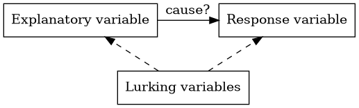
The explanatory variable might be the cause of a change in the response variable. But we have to watch out for other variables that aren’t part of the study called lurking variables.
A lurking variable that might be associated with both the explanatory and response variable is called a confounding variable.
We say that correlation is not causation because you can’t assume that there is a cause and effect relationship between two variables just because they are strongly associated. The association might be caused by lurking variables or the causal relationship might go in the opposite direction of what you expect.
Experiments versus Observational Studies
An experiment is a study where the individuals are placed into different treatment groups by the researchers. An observational study is one where the researchers do not place the individuals into different treatment groups.
A randomized controlled experiment is one where the individuals are randomly assigned to treatment groups.
Important concept: Random assignment automatically controls all lurking variables, which let’s you establish cause and effect.
We looked at these examples.
A study tried determine whether cellphones cause brain cancer. The researchers interviewed 469 brain cancer patients about their cellphone use between 1994 and 1998. They also interviewed 469 other hospital patients (without brain cancer) who had the same ages, genders, and races as the brain cancer patients.
In 1954, the polio vaccine trials were one of the largest randomized controlled experiments ever conducted. Here were the results.
We talked about why the polio vaccine trials were double blind and what that means.
Here is one more example we didn’t have time for:
Do magnetic bracelets work to help with arthritis pain?
We finished by talking about anecdotal evidence.
Today we introduced probability models which always have two parts:
A subset of the sample space is called an event. We already intuitively know lots of probability models, for example we described the following probability models:
Flip a coin.
Roll a six-sided die.
If you roll a six-sided die, what is
The proportion of people in the US with each of the four blood types is shown in the table below.
| Type | O | A | B | AB |
|---|---|---|---|---|
| Proportion | 0.45 | 0.40 | 0.11 | ? |
What is
Today we talked about the multiplication and addition rules for probability. We also talked about independent events and conditional probability. We started with these examples.
If you roll two six-sided dice, the results are independent. What is the probability that both dice land on a six?
Suppose you shuffle a deck of 52 playing cards and then draw two cards from the top. Find
Then we did this workshop:
| Day | Section | Topic |
|---|---|---|
| Mon, Oct 6 | 3.4 | Weighted averages & expected value |
| Wed, Oct 8 | 3.4 | Random variables |
| Fri, Oct 10 | 7.1 | Sampling distributions |
Today we talked about weighted averages. To find a weighted average:
We did this workshop.
Before that, we did some examples.
Calculate the final grade of a student who gets an 80 quiz average, 72 midterm average, 95 project average, and an 89 on the final exam.
Eleven nursing students graduated from a nursing program. Four students completed the program in 3 years, four took 4 years, two took 5 years, and one student took 6 years to graduate. Express the average time to complete the program as a weighted average.
The expected value (also known as the theoretical average) is the weighted average of the outcomes in a probability model, using the probabilities as the weights.
The Law of Large Numbers. When you repeat a random experiment many times, the sample mean tends to get closer to the theoretical average .
Today we talked about probability distributions. A probability distribution is a probability model where the outcomes are numbers. We often use capital letters like and as random variables. A random variable represents the possible outcome of a random experiment that follows a probability distribution. A random variable has:
Every probability distribution can be described by three things:
It turns out that betting on 7 has the same expected value as betting on black, but the standard deviations are not the same ( for betting on a number versus if you bet on black).
We talked about the difference between continuous distributions where there is an infinite range of outcomes between any two possibilities, and discrete distributions which only have finitely many outcomes between any two possibilities. The normal distribution is continuous, rolling a six-sided die is discrete.
An important discrete probability distribution is the binomial distribution which counts the total number of successes when you flip a fair or unfair coin times. The number is the probability of a success on each flip.
Suppose you play 100 games of roulette and bet on 7 every time. Use the binomial distribution app to find the probability that you win more money than you lose.
What about playing 100 games and betting on black every time? Which is a better strategy?
We finished by talking about the trade-off between risk () versus expected returns () when investing.
Suppose we are trying to study a large population with mean and standard deviation . If we take a random sample, the sample mean is a random variable and its probability distribution is called the sampling distribution of . Assuming that the population is large and our sample is a simple random sample, the sampling distribution always has the following features:
Sampling Distribution of .
Examples of sampling distributions.
Every week in the Fall there are about 15 NFL games. In each game, there are about 13 kickoffs, on average. So we can estimate that there might be about 200 kickoffs in one week of NFL games. Those 200 kickoffs would be a reasonably random sample of all NFL kickoffs. Describe the sampling distribution of the average kickoff distance.
The average American weighs lbs. with a standard deviation of lbs. If a commuter plan is designed to seat 22 passengers, what is the probability that the combined weight of the passengers would be greater than lbs? Hint: This is the same as finding
| Day | Section | Topic |
|---|---|---|
| Mon, Oct 13 | Fall break - no class | |
| Wed, Oct 15 | 5.1 | Sampling distributions for proportions |
| Fri, Oct 17 | 5.2 | Confidence intervals for a proportion |
We started with this warm-up problem which is a review of the things we talked about last week.
Annual rainfall totals in Farmville are approximately normal with mean 44 inches and standard deviation 7 inches.
How likely is a year with more than 50 inches of rain?
How likely is a whole decade with average annual rainfall over 50 inches?
Then we talked about sample proportions which are denoted and can be found using the formula In a SRS from a large population, is random with a sampling distribution that has the following features.
Sampling Distribution of .
We did the following exercises in class.
In my morning class, 18 out of 28 students were born in VA. Is a statistic or a parameter? Should you denote it as or ? (In my afternoon class, the proportion was 10 out of 19.)
In the United States about 7.2% of people have type O-negative blood, so they are universal donors. Is 7.2% a parameter () or a statistic ()?
If a hospital has patients, describe the sampling distribution for the proportion of patients who are universal donors.
Find the probability that .
Assuming that the true proportion of all HSC students that were born in VA is 50%, describe the sampling distribution for in a random sample of students.
About one third of American households have a pet cat. If you randomly select households, describe the sampling distribution for the proportion that have a pet cat.
According to a 2006 study of 80,000 households, 31.6% have a pet cat. Is 31.6% a statistic or a parameter? Would it be better to use the symbol or to represent it?
Last time we saw that is a random variable with a sampling distribution. We started today with this exercise from the book:
Then we talked about the following simple idea: there is a 95% chance that is within 2 standard deviations of the true population proportion . So if we want to estimate what the true is, we can use a 95% confidence interval:
The confidence interval formula has two parts: a best guess estimate (or point estimate) before the plus/minus symbol, and a margin of error after the symbol. The formula for the margin of error is 2 times the standard error which is an approximation of using instead of .
In our class 13 out of 24 students were born in VA. Use the 95% confidence interval formula to estimate the percent of all HSC students that were born in VA.
A 2017 Gallop survey of 1,011 American adults found that 38% believe that God created man in his present form. Find the margin of error for a 95% confidence interval to estimate the percent of all Americans who share this belief.
| Day | Section | Topic |
|---|---|---|
| Mon, Oct 20 | 5.2 | Confidence intervals for a proportion - con’d |
| Wed, Oct 22 | Review | |
| Fri, Oct 24 | Midterm 2 |
Last time we only looked at 95% confidence intervals, but you can adjust the confidence level by using the following formula.
Confidence Interval for a Proportion. To estimate a population proportion, use
The variable is called the critical z-value is determined by the desired confidence level. Here are some common choices.
| Confidence Level | 90% | 95% | 99% | 99.9% |
|---|---|---|---|---|
| Critical z-value () | 1.645 | 1.96 | 2.576 | 3.291 |
This formula works well as long as two assumptions are true:
No Bias. The data should come from a simple random sample to avoid bias.
Normality. The sample size must be large enough for to be normally distributed. A rule of thumb (the success-failure condition) is that you should have at least 15 “successes” and 15 “failures” in the sample.
Examples.
In 2004 the General Social Survey found 304 out 977 Americans always felt rushed. Find the margin of error for a 90% confidence interval with this data.
What are we 90% sure is true about the confidence interval we found? Only one of the following is the correct answer. Which is it?
About half of HSC students were born in Virginia. Given this
fact, approximately how large of a sample of HSC students would you need
to get a margin of error for a 95% confidence interval under 10%?
We talked about the midterm 2 review in class today. The solutions are online now too.
We also did the following extra problem about conditional probability.
Suppose that half of the voters in one county are women. There are two candidates running, a Democrat and a Republican. 60% of the women support the Democrat, but only 35% of the men in the county do. Assume that every voter supports one of the two candidates. Find the following probabilities.
| Day | Section | Topic |
|---|---|---|
| Mon, Oct 27 | 5.3 | Hypothesis testing for a proportion |
| Wed, Oct 29 | 6.1 | Inference for a single proportion |
| Fri, Oct 31 | 5.3.3 | Decision errors |
Today we introduced hypothesis testing. This is a tool for answering yes/no questions about a population parameter. We started with this example:

Every hypothesis test starts with two possibilities:
Here are the steps to do a hypothesis test for a single proportion:
State the hypotheses. These will pretty much always look like
Calculate the test statistic. Using the formula
Find the p-value. The p-value is the probability of getting a result at least as extreme as the sample statistic if the null hypothesis is true.
Explain what it means. A low p-value is evidence that we should reject the null hypotheses. Usually this means that the results are too surprising to be caused by random chance along. A p-value over 5% means the results might be a random fluke and we should not reject .
| p-value | Meaning |
|---|---|
| Over 5% | Weak evidence |
| 1% to 5% | Moderate evidence |
| 0.1% to 1% | Strong evidence |
| Under 0.1% | Very strong evidence |
On Monday we introduced hypothesis testing:
One-Sample Hypothesis Test for a Proportion
When we do a hypothesis test, we need to make sure that the assumptions of a hypothesis test are satisfied. There are two that we need to check:
We started with this example:
We talked about how the null hypotheses must give a specific value for the parameter of interest so that we can create a null model that we can test. If the sample statistic is far from what we expect, then we can reject the null hypothesis and say that the results are statistically significant. Unlike in English, the word significant does not mean “important” in statistics. It actually means the following.
Logic of Hypothesis Testing. The following are all equivalent:
Watch out: When the evidence is weak, we don’t accept the null hypothesis. We just say the results are inconclusive and we fail to reject the null hypothesis.
We finished with these exercises from the book.
Notice that in 5.16(b), you could make the case that we have prior knowledge based on the reputation of the state of Wisconsin to guess that that percent of people who have drank alcohol in the last year in Wisconsin (which we denoted ) satisfies a one-sided alternative hypothesis: If you don’t know about Wisconsin, then you should definitely use the two-sided alternative hypothesis: The only difference is when you calculate the p-value, you use two tails of the bell curve if you are doing a two-sided p-value. If you aren’t sure, it is always safe to use a two-sided alternative.
One thing you have to decide when you do a hypothesis test is how strong the evidence needs to be in order to convince you to reject the null hypothesis. Historically people aimed for a significance level of . A p-value smaller than that was usually considered strong enough evidence to reject . Now people often want stronger evidence than that, so you might want to aim for a significance level of . In some subjects like physics where things need to be super rigorous they use even lower values for . Unlike the p-value, you pick the significance level before you look at the data.
In the back of your mind, remember there are four possible things that might happen in a null hypothesis.| is true | is true | |
|---|---|---|
| p-value below | Type I error (false positive) | Reject |
| p-value above | Don’t reject | Type II error (false negative) |
If is true, then the significance level that you choose is the probability that you will make a type I error which is when you reject when you shouldn’t. The disadvantage of making really small is that it does increase the chance of a type II error which is when you don’t reject even though you should.
In a criminal trial the prosecution tries to prove that the defendant is “guilty beyond a reasonable doubt”. Think of a type I error as when the jury convicts an innocent defendant. A type II error would be if the jury does not convict someone who is actually guilty.
After that, we introduced:
Two-Sample Hypothesis Test for Proportions.
where is the pooled proportion:
We rushed a bit at the end to squeeze in this example.
| Day | Section | Topic |
|---|---|---|
| Mon, Nov 3 | 6.2 | Difference of two proportions (hypothesis tests) |
| Wed, Nov 5 | 6.2.3 | Difference of two proportions (confidence intervals) |
| Fri, Nov 7 | 7.1 | Introducing the t-distribution |
We started by reviewing what we introduced last time.
Two-Sample Hypothesis Test for Proportions.
where is the pooled proportion:
As with any statistical inference method, this technique is based on two key assumptions:
We used the 2-sample hypothesis test on this example.
If you want to estimate how big the gap between the population proportions and is, then use:
Two-sample confidence interval for proportions.
Works best if both samples contain at least 10 successes and 10 failures.
Because the formulas for two-sample confidence intervals and hypothesis tests are so convoluted, I posted an interactive formula sheet under the software tab of the website. Feel free to use it on the projects when you need to calculate these formulas.
Two sample confidence intervals for proportions are a little less robust than hypothesis tests. It is recommended that you should have at least 10 successes & 10 failures in each group before you put much trust in the interval.
We started with this example:
We have been focused on inference about proportions of a categorical variable. Today we started talked about how to do inference about a quantitative variable like height. This semester, my two sections of statistics have an average height of 70.94 inches with a standard deviation of 2.90 inches. This is data from 47 students. This suggests that maybe Hampden-Sydney students are taller than average for men in the United States. So we made these hypotheses:
To test these, we reviewed what we know about the sampling distribution for , and we tried to find the z-value using the formula Unfortunately, we don’t know the population standard deviation for all HSC students. We only know the sample standard deviation. If we use that instead of , then we get a t-value: which follows a t-distribution. We talked about how to use the t-distribution app to calculate probabilities on a t-distribution. One weird thing about t-distributions is that they have degrees of freedom (denoted by either df or ).
One-Sample Hypothesis Test for Means.
This -value has degrees of freedom.
We briefly talked about why this is. Then we used the app to find a p-value for our class data and see whether or not we have strong evidence that HSC students are taller on average than other men in the USA. The logic of p-values is exactly the same for a t-test as it is for a hypothesis test with the normal distribution.
We finished with this example:
| Day | Section | Topic |
|---|---|---|
| Mon, Nov 10 | 7.1.4 | One sample t-confidence intervals |
| Wed, Nov 12 | 7.2 | Paired data |
| Fri, Nov 14 | 7.3 | Difference of two means |
t-Distribution Confidence Interval. To estimate a population mean use
In order to use this formula, you need to find the critical t-value for the confidence level you want. The easiest way is to look up the value on a table. Use degrees of freedom.
We talked about how to use the table to find -values. Then we did the following example.
Here is another example that we didn’t have time for.
We also did this workshop.
t-distribution methods require the following assumptions:
No Bias. Data should be a simple random sample from the population.
Normality. The sampling distribution for should be normal. This tends to be true if the sample size is big. Here is a quick rule of thumb:
We talked about comparing the averages of two correlated variables. You can use one sample t-distribution methods to do this as long as you focus on the matched pairs differences. The key is to focus on the difference or gap between the variables. For a matched pairs t-test, we always use the following:
| Hypotheses | Test Statistic |
|---|---|
Does the data in this sample of couples getting married provide significant evidence that husbands are older than their wives on average? What is the average age gap? Use a one-sample hypothesis test and confidence interval for the average difference.
Are the necessary assumptions for a t-test and a t-confidence interval satisfied in the previous example?
Do helium filled footballs go farther when you kick them? An article in the Columbus Dispatch from 1993 described the following experiment. One football was filled with helium and another identical football with regular air. Each football was kicked 39 times and the two footballs alternated with each kick. The distances traveled by the balls on each kick is recorded in this spreadsheet: Helium filled footballs.
Does this data provide statistically significant evidence that helium filled footballs go farther when kicked?
Today we introduced the last two inference formulas from the interactive formula sheet: two sample inference for means. We looked at this example which is from a study where college student volunteers wore a voice recorder that let the researchers estimate how many words each student spoke per day.
Here are side-by-side box and whisker plots for the data:
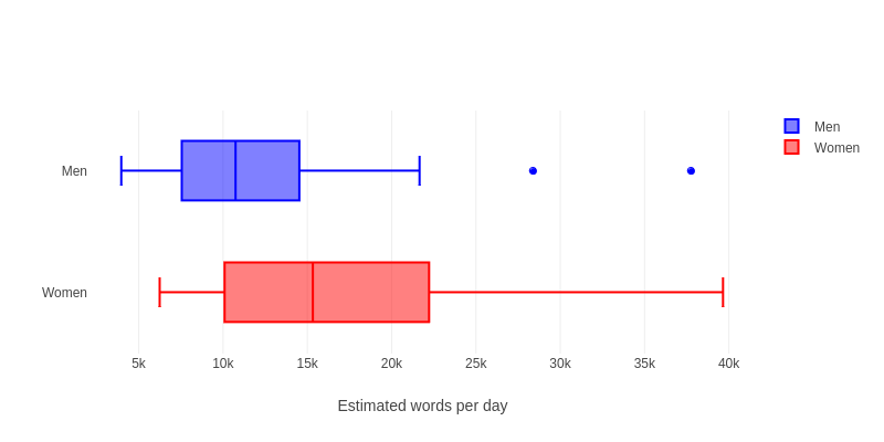
This picture suggests that there might be a difference between men & women, but is it really significant? Or could this just be a random fluke? To find out, we can do a two sample t-test.
Two-Sample Hypothesis Test for Means
You can use the smaller sample size minus one as the degrees of freedom.
When you do a two sample t-test (or a 2-sample t-confidence interval), there is a complicated formula for the right degrees of freedom. But an easy safe approximation is this: in other words, use the smaller sample size minus 1 as the degrees of freedom.
Here is a quick summary of the numbers we need to calculate the t-value for the example with men & women talking.
| Women | 27 | 16,496.1 | 7,914.3 |
| Men | 20 | 12,866.7 | 8,342.5 |
Cloud Seeding. An experiment done in the 1970’s looked at whether it is possible to spray clouds with a silver iodide solution to increase the amount of rain that falls in an area. On 26 days with promising clouds a plane sprayed the clouds with silver iodide solution and on 26 similar days they didn’t spray. The amount of rainfall (measured in acre-feet) was tracked by radar. Here were the results:
| Seeded | 26 | 442.0 | 650.8 |
| Control | 26 | 164.6 | 278.4 |
| Day | Section | Topic |
|---|---|---|
| Mon, Nov 17 | 7.3 | Difference of two means |
| Wed, Nov 19 | Review | |
| Fri, Nov 21 | Midterm 3 | |
| Mon, Nov 23 | 7.4 | Statistical power |
Today we introduced the 2-sample confidence interval for means.
Two Sample Confidence Interval for Means
Use this to estimate the gap between two population means.
You can use the smaller sample size minus one as the degrees of freedom to find .
These formulas (both the two-sample t-test and t-confidence interval) are based on the same key assumptions.
No Bias. As always, we need good simple random samples to avoid bias.
Normality. The t-distribution methods are based on the normal distribution. If the sample sizes are big enough, then you don’t need to worry to much about normality. Two-sample t-distribution methods are very robust, which means they tend to work well even with data that isn’t quite normal.
After that, we did this workshop in class.
Today we talked about the midterm 3 review problems. We also talked about how to choose the right inference method. Ask these three questions to decide which interference formula to use:
The answer to these three questions will guide you to the right formula to use. We applied these questions to the following examples in class:
We also reviewed how to find p-values using the app and how to use the t-distribution table (including how to find critical z-values in addition to t-values).
One question that will definitely be on the midterm is this: what is the exact definition of a p-value? To answer this question you need to memorize:
A p-value is the probability of getting a result at least as extreme as the observed data, if the null hypothesis is true.
Today we talked about statistical power.
Definition. A study is statistically powerful if the sample size is large enough so that random error probably won’t cause a Type II error. You can tell if test is powerful by estimating the margin of error of a confidence interval with plausible data and making sure it is smaller than the effect size you hope to find.
We did this workshop in class:
| Day | Section | Topic |
|---|---|---|
| Mon, Dec 1 | 6.3 | Chi-squared statistic |
| Wed, Dec 3 | 6.4 | Testing association with chi-squared |
| Fri, Dec 5 | Choosing the right technique | |
| Mon, Dec 8 | Last day, recap & review |
This week we are going to introduce one more inference technique known as the chi-squared test for association. The statistic let’s you measure if an association between two categorical variables is statistically significant. Before we talked about the statistic, we looked at two-way tables. We talked about how to find row and column percentages in a two-way table.
The 2003-04 National Health & Nutrition Exam Survey asked participants how they felt about their weight (options were “underweight”, “about right”, or “overweight”). The results are shown in the two-way table below, broken down by gender.
| Female | Male | Total | |
|---|---|---|---|
| Underweight | 116 | 274 | 390 |
| About right | 1175 | 1469 | 2644 |
| Overweight | 1730 | 1112 | 2842 |
| Total | 3021 | 2855 | 5876 |
What percent of women said that they felt overweight?
What percent of overweight people were women?
An association between two categorical variables is statistically significant if there is strong evidence that the association holds in the population, not just in the sample. In a χ² test, you always test the following hypotheses:
To determine whether or not to reject , use a computer to find the statistic for the two-way table. If is true, then the statistic should follow a χ² distribution with degrees of freedom equal to: You can use the χ² distribution app to find the corresponding p-value.
The two-way table above has a chi-squared statistic of . How many degrees of freedom does the table have and what is the corresponding p-value?
Is the association between gender and perceived body weight statistically significant?
A study from the 1990s looked at whether the anti-retroviral drug AZT can help prevent pregnant women with HIV from passing the virus on to their children. The mom’s were randomly assigned to receive either AZT or a placebo, and the results are shown in the two-way table below.
|
HIV-positive baby |
HIV-negative baby |
|
|---|---|---|
|
AZT |
13 |
167 |
|
Placebo |
40 |
143 |
This table has . Is this strong evidence that AZT works better than a placebo?
Today we talked some more about the -test for association. We mentioned that the -distribution has these features:
The assumptions for the -test are:
We did the following example where the -test is inconclusive:
The 2008 General Social Survey asked people if they were “very happy”, “pretty happy”, or “not too happy” with their lives. Here are the results broken down by gender.
|
Female |
Male |
|
|---|---|---|
|
Very Happy |
271 |
328 |
|
Pretty Happy |
513 |
587 |
|
Not Too Happy |
142 |
174 |
This table has . Is there a statistically significant association between the two variables in this two way table? What are the two variables?
Class was canceled because of snow.
Today we went over answers to the review questions for the final exam.