| Day | Section | Topic |
|---|---|---|
| Mon, Aug 24 | 1.2 | Data tables, variables, and individuals |
| Wed, Aug 26 | 2.1.3 | Histograms & skew |
| Fri, Aug 28 | 2.1.5 | Boxplots |
Today we covered data tables, individuals, and variables. We also talked about the difference between categorical and quantitative variables.
In the data table in the example above, who or what are the individuals? What are the variables and which are quantitative and which are categorical?
If we want to compare states to see which are safer, why is it better to compare the rates instead of the total fatalities?
What is wrong with this student’s answer to the previous question?
Rates are better because they are more precise and easier to understand.
I like this incorrect answer because it is a perfect example of bullshit. This student doesn’t know the answer so they are trying to write something that sounds good and earns partial credit. Try to avoid writing bullshit. If you catch yourself writing B.S. on one of my quizzes or tests, then you can be sure that you a missing a really simple idea and you should see if you can figure out what it is.
We talked briefly about making bar charts for categorical data.
Then we introduced stem & leaf plots (stemplots) and histograms for quantitative data. We started by making a stemplot and a histogram for the weights of the students in the class. We also talked about how to tell if data is skewed left or skewed right.
Can you think of a distribution that is skewed left?
Why isn’t this bar graph from the book a histogram?
Then we did this workshop:
We finished by reviewing the mean and the median.
We introduced the five number summary and box-and-whisker plots (boxplots). We started by reviewing the median.
The median of numbers is located at position .
The median is not affected by skew, but the average is pulled in the direction of the skew. So the average will be bigger than the median when the data is skewed right, and smaller when the data is skewed left.
We also talked about the interquartile range (IQR) and how to use the rule to determine if data is an outlier. We also mentioned that a statistic is robust if it is not affected by skew and outliers. Both the median and the IQR are robust statistics.
We started with this simple example:
An 8 man crew team actually includes 9 men, the 8 rowers and one coxswain. Suppose the weights (in pounds) of the 9 men on a team are as follows:
120 180 185 200 210 210 215 215 215Find the 5-number summary and draw a box-and-whisker plot for this data. Is the coxswain who weighs 120 lbs. an outlier?
| Day | Section | Topic |
|---|---|---|
| Mon, Aug 31 | 2.1.4 | Standard deviation |
| Wed, Sep 2 | 4.1 | Normal distribution |
| Fri, Sep 4 | 4.1.4 | Normal distribution computations |
We also introduced the standard deviation. We did this one example of a standard deviation calculation by hand, but you won’t ever have to do that again in this class.
11 students just completed a nursing program. Here is the number of years it took each student to complete the program. Find the standard deviation of these numbers.
3 3 3 3 4 4 4 4 5 5 6From now on we will just use software to find standard deviation. In
a spreadsheet (Excel or Google Sheets) you can use the
=STDEV() function.
Which of the following data sets has the largest standard deviation?
We finished by looking at some examples of histograms that have a shape that looks roughly like a bell. This is a very common pattern in nature that is called the normal distribution.
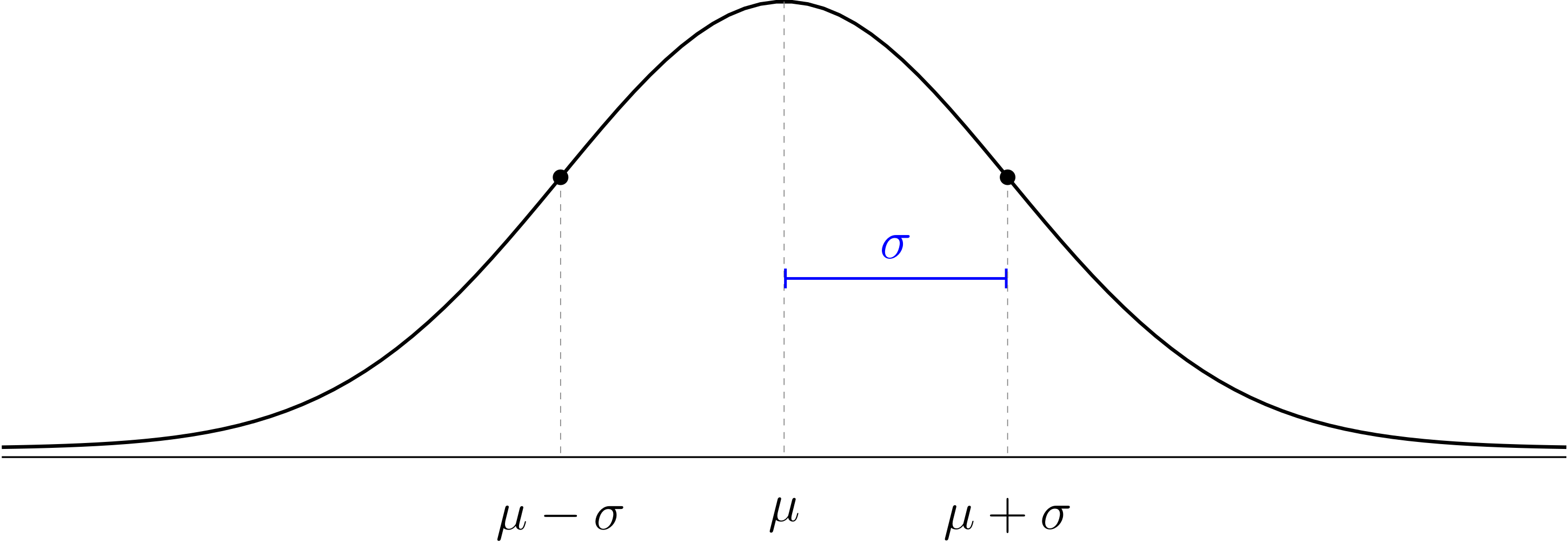
The normal distribution is a mathematical model for data with a histogram that is shaped like a bell. The model has the following features:
The normal distribution is a theoretical model that doesn’t have to perfectly match the data to be useful. We use Greek letters and for the theoretical mean and standard deviation of the normal distribution to distinguish them from the sample mean and standard deviation of our data which probably won’t follow the theoretical model perfectly.
We talked about z-values and the 68-95-99.7 rule.
We also did these exercises before the workshop.
In 2020, Farmville got 61 inches of rain total (making 2020 the second wettest year on record). How many standard deviations is this above average?
The average high temperature in Anchorage, AK in January is 21 degrees Fahrenheit, with standard deviation 10. The average high temperature in Honolulu, HI in January is 80°F with σ = 8°F. In which city would it be more unusual to have a high temperature of 57°F in January?
Today we used the Probability Distributions app (android version, iOS version) to calculate normal distribution probabilities.
(Percent below) SAT verbal scores are roughly normally distributed with mean μ = 500, and σ = 100. Estimate the percentile of a student with a 560 verbal score.
(Percent above) What percent of students get above a 560 verbal score on the SATs?
(Percent to locations) What SAT score is in the 90th percentile?
(Percent between) What percent of years do we get between 40 and 50 inches of rain in Farmville?
We also talked about the probability shorthand notation which literally means “the probability that the outcome X is less than x”. Then we did this workshop.
| Day | Section | Topic |
|---|---|---|
| Mon, Sep 7 | No class (Labor day) | |
| Wed, Sep 9 | 2.1, 8.1 | Scatterplots and correlation |
| Fri, Sep 11 | 8.2 | Least squares regression introduction |
We introduced scatterplots and correlation coefficients with these examples:
Important concept: correlation does not change if you change the units or apply a simple linear transformation to the axes. Correlation just measures the strength of the linear trend in the scatterplot.
Another thing to know about the correlation coefficient is that it only measures the strength of a linear trend. The correlation coefficient is not as useful when a scatterplot has a clearly visible nonlinear trend.
We finished by introducing the least squares regression line which has these features:
The two main applications of a least squares regression line are:
It is important to be able to describe the units of the slope.
We started by deriving the slope-intercept formula for a least squares regression line.
where is the slope and is the y-intercept.
What are the slope and y-intercept to predict someone’s weight based on their height?
What are the units of the slope for predicting someone’s weight from their height?
We also introduced the following concepts.
The coefficient of determination. represents the proportion of the variability of the -values that follows the trend line. The remaining represents the proportion of the variability that is above and below the trend line.
Regression to the mean. Extreme -values tend to have less extreme predicted -values in a least squares regression model.
The regression line for predicting midterm 2 grades based on midterm 1 is: with a coefficient of determination .
| Day | Section | Topic |
|---|---|---|
| Mon, Sep 14 | 8.2 | Least squares regression practice |
| Wed, Sep 16 | 1.3 | Sampling: populations and samples |
| Fri, Sep 18 | 1.3 | Bias versus random error |
Before the workshop, we started with this warm-up exercise.
We talked about the difference between samples and populations. The central problem of statistics is to use sample statistics to answer questions about population parameters.
We looked at an example of sampling from the Gettysburg address, and we talked about the central problem of statistics: How can you answer questions about the population using samples?
The reason this is hard is because sample statistics usually don’t match the true population parameter. There are two reasons why:
We looked at this case study:
Important Concepts
Bigger samples have less random error.
Bigger samples don’t reduce bias.
The only sure way to avoid bias is a simple random sample.
We finished with this practice problem:
Suppose you want to determine the percent of grocery stores that carry a specific brand of pasta. To find out, you visit a random selection of nearby grocery stores. In this situation, identify the following:
We did this workshop.
| Day | Section | Topic |
|---|---|---|
| Mon, Sep 21 | 1.4 | Randomized controlled experiments |
| Wed, Sep 23 | Review | |
| Fri, Sep 25 | Midterm 1 |
One of the hardest problems in statistics is to prove causation. Here is a diagram that illustrates the problem.
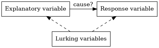
The explanatory variable might be the cause of a change in the response variable. But we have to watch out for other variables that aren’t part of the study called lurking variables. When researchers take a variable into account in a study, we say it is controlled.
A lurking variable that might be associated with both the explanatory and response variable is called a confounding variable.
We say that correlation is not causation because you can’t assume that there is a cause and effect relationship between two variables just because they are strongly associated. The association might be caused by lurking variables or the causal relationship might go in the opposite direction of what you expect.
An experiment is a study where individuals are put into different treatment groups. An experiment is randomized if the individuals are randomly assigned to the treatment groups. An observational study is one where the researchers do not place the individuals into different treatment groups.
We looked at these examples.
A study tried determine whether cellphones cause brain cancer. The researchers interviewed 469 brain cancer patients about their cellphone use between 1994 and 1998. They also interviewed 469 other hospital patients (without brain cancer) who had the same ages, genders, and races as the brain cancer patients.
In 1954, the polio vaccine trials were one of the largest randomized controlled experiments ever conducted. Here were the results.
We talked about why the polio vaccine trials were double blind and what that means.
Do magnetic bracelets work to help with arthritis pain?
We finished by talking about anecdotal evidence.
We talked about the midterm 1 review problems.
| Day | Section | Topic |
|---|---|---|
| Mon, Sep 28 | 3.1 | Defining probability |
| Wed, Sep 30 | 3.1 | Multiplication and addition rules |
| Fri, Oct 2 | 3.4 | Weighted averages & expected value |
Today we introduced probability models which always have two parts:
A subset of the sample space is called an event. We already intuitively know lots of probability models, for example we described the following probability models:
Flip a coin.
Roll a six-sided die.
If you roll a six-sided die, what is
The proportion of people in the US with each of the four blood types is shown in the table below.
| Type | O | A | B | AB |
|---|---|---|---|---|
| Proportion | 0.45 | 0.40 | 0.11 | ? |
What is
Today we talked about the multiplication and addition rules for probability. We also talked about independent events and conditional probability. We started with these examples.
If you roll two six-sided dice, the results are independent. What is the probability that both dice land on a six?
Suppose you shuffle a deck of 52 playing cards and then draw two cards from the top. Find
Then we did this workshop:
Today we talked about weighted averages. To find a weighted average:
We did this workshop.
Before that, we did some examples.
Calculate the final grade of a student who gets an 89 quiz average, 73 midterm average, 90 project average, and an 81 on the final exam.
Eleven nursing students graduated from a nursing program. Four students completed the program in 3 years, four took 4 years, two took 5 years, and one student took 6 years to graduate. Express the average time to complete the program as a weighted average.
The expected value (also known as the theoretical average) is the weighted average of the outcomes in a probability model, using the probabilities as the weights.
| # of Hurricanes | 0 | 1 | 2 | 3 |
|---|---|---|---|---|
| Probability | 0.65 | 0.28 | 0.06 | 0.01 |
The Law of Large Numbers. When you repeat a random experiment many times, the sample mean tends to get closer to the theoretical average .
| Day | Section | Topic |
|---|---|---|
| Mon, Oct 5 | 3.4 | Discrete versus continuous distributions |
| Wed, Oct 7 | 7.1 | Sampling distributions |
| Fri, Oct 9 | 5.1 | Sampling distributions for proportions |
We started with these warm-up problems.
What is the expected value from the raffle tickets example in the workshop from Friday?
Last time we calculated the expected value if you play roulette and bet $1 on a color like black. If you bet $1 on a number, like 7, then you only have a 1/38 chance of winning, but you get $36 if you win. Find the expected value for this bet.
After that we introduced the binomial distribution which is the distribution of the possible number of successes if you do N independent random trials that each have a probability p of a success.
The binomial distribution is an example of a discrete distribution which means that there are only finitely many possible outcomes between any two values. The normal distribution is an example of a continuous distribution which can have an infinite range of possible outcomes between two values.
Every probability distribution can be described by three things:
If you play 100 games of roulette and bet on black every time, then the distribution for the amount of money you might get is approximately normal with and . Use the normal distribution to approximate the probability that you win more money than you lose (i.e., win more than $100)
Suppose you play 100 games of roulette and bet on 7 every time. In this case , , but the distribution is definitely not normal! Use the binomial distribution app to find the probability that you win more money than you lose. Which is a better strategy, betting on one number or one color?
Another example of a discrete probability distribution is the total when you roll one or more dice.
We finished by talking about the trade-off between risk () versus expected returns () when investing.
Suppose we are trying to study a large population with mean and standard deviation . If we take a random sample, the sample mean is a random variable and its probability distribution is called the sampling distribution of . Assuming that the population is large and our sample is a simple random sample, the sampling distribution always has the following features:
Examples of sampling distributions.
Every week in the Fall there are about 15 NFL games. In each game, there are about 13 kickoffs, on average. So we can estimate that there might be about 200 kickoffs in one week of NFL games. Those 200 kickoffs would be a reasonably random sample of all NFL kickoffs. Describe the sampling distribution of the average kickoff distance.
The average American weighs lbs. with a standard deviation of lbs. If an airplane is designed to seat 22 passengers, what is the probability that the combined weight of the passengers would be greater than 4,000 lbs? Hint: This is the same as finding
We talked about sample proportions which are denoted and can be found using the formula In a SRS from a large population, is random with a sampling distribution that has the following features.
Sampling Distribution of .
We did the following exercises in class.
This semester, 28 out of 54 students in my statistics class were born in VA. Is a statistic or a parameter? Should you denote it as or ?
In the United States about 7.2% of people have type O-negative blood, so they are universal donors. Is 7.2% a parameter () or a statistic ()?
If a hospital has patients, describe the sampling distribution for the proportion of patients who are universal donors.
Find the probability that .
| Day | Section | Topic |
|---|---|---|
| Mon, Oct 12 | No class (Fall break) | |
| Wed, Oct 14 | 5.2 | Confidence intervals for a proportion |
| Fri, Oct 16 | 5.2 | Confidence intervals for a proportion - con’d |
Today we introduced confidence intervals for proportions. These are based on a simple idea: there is a 95% chance that the sample proportion is no more than 2 standard deviations away from the true population proportion .
Works best if there are at least 15 “successes” and 15 “failures” in the sample.
The variable is called the critical z-value is determined by the desired confidence level. Here are some common choices.
| Confidence Level | 90% | 95% | 99% | 99.9% |
|---|---|---|---|---|
| Critical z-value () | 1.645 | 1.96 | 2.576 | 3.291 |
In order to trust a confidence interval, you need these two assumptions to hold:
No Bias. The data should come from a simple random sample to avoid bias.
Normality. The sample size must be large enough for to be normally distributed. A rule of thumb (the success-failure condition) is that you should have at least 15 “successes” and 15 “failures” in the sample.
We did the following examples in class.
In my statistics classes 28 out of 54 students were born in VA. Use the 95% confidence interval formula to estimate the percent of all HSC students that were born in VA.
In 2004 the General Social Survey found 304 out 977 Americans always felt rushed. Find the 90% confidence interval for the proportion of Americans who always feel rushed.
What are we 90% sure is true about the confidence interval we found? Only one of the following is the correct answer. Which is it?
A confidence interval has two parts: a best guess estimate (or point estimate) before the plus/minus symbol, and a margin of error after the symbol.
Last time we introduced confidence intervals for proportions. Today we did some more examples related to confidence intervals.
A 2017 Gallop survey of 1,011 American adults found that 38% believe that God created man in his present form. Find a 95% confidence interval to estimate the percent of all Americans who share this belief.
A university newspaper is conducting a survey to determine what fraction of students support a $200 a year increase in fees to pay for a new football stadium. How big of a sample is required to ensure the margin of error is smaller than 0.04 using a 95% confidence level?
One of our first examples of sampling was the Literary Digest magazine poll from the 1936 presidential election. They had a huge sample with 2.4 million responses. In that sample, 62% supported Alfred Landon (R) over FDR (D). What is the margin of error for a 99% confidence interval with this data?
How is it possible that the margin of error could be so small if the poll was so wrong?
| Day | Section | Topic |
|---|---|---|
| Mon, Oct 19 | 5.3 | Hypothesis testing for a proportion |
| Wed, Oct 21 | Review | |
| Fri, Oct 23 | Midterm 2 |
Today we introduced hypothesis testing. This is a tool for answering yes/no questions about a population parameter. We started with this example:

Every hypothesis test starts with two possibilities:
Here are the steps to do a hypothesis test for a single proportion:
State the hypotheses. These will pretty much always look like
Calculate the test statistic. Using the formula
Find the p-value. The p-value is the probability of getting a result at least as extreme as the test statistic if the null hypothesis is true.
Explain what it means. A low p-value is evidence that we should reject the null hypotheses. Usually this means that the results are too surprising to be caused by random chance along. A p-value over 5% means the results might be a random fluke and we should not reject .
| p-value | Meaning |
|---|---|
| Over 5% | Weak evidence |
| 1% to 5% | Moderate evidence |
| 0.1% to 1% | Strong evidence |
| Under 0.1% | Very strong evidence |
We talked about the midterm 2 review in class today. The solutions are online now too.
| Day | Section | Topic |
|---|---|---|
| Mon, Oct 26 | 6.1 | Inference for a single proportion |
| Wed, Oct 28 | 5.3.3 | Decision errors |
| Fri, Oct 30 | 6.2 | Difference of two proportions (hypothesis tests) |
| Day | Section | Topic |
|---|---|---|
| Mon, Nov 2 | 6.2.3 | Difference of two proportions (confidence intervals) |
| Wed, Nov 4 | 7.1 | Introducing the t-distribution |
| Fri, Nov 6 | 7.1.4 | One sample t-confidence intervals |
| Day | Section | Topic |
|---|---|---|
| Mon, Nov 9 | 7.2 | Paired data |
| Wed, Nov 11 | 7.3 | Difference of two means |
| Fri, Nov 13 | 7.3 | Difference of two means - con’d |
| Day | Section | Topic |
|---|---|---|
| Mon, Nov 16 | Choosing the right technique | |
| Wed, Nov 18 | Review | |
| Fri, Nov 20 | Midterm 3 |
| Day | Section | Topic |
|---|---|---|
| Mon, Nov 23 | 7.4 | Statistical power |
| Wed, Nov 25 | No class (Thanksgiving break) | |
| Fri, Nov 27 | No class (Thanksgiving break) |
| Day | Section | Topic |
|---|---|---|
| Mon, Nov 30 | 6.3 | Chi-squared statistic |
| Wed, Dec 2 | 6.4 | Testing association with chi-squared |
| Fri, Dec 4 | Chi-squared caveats | |
| Mon, Dec 7 | Last day, recap & review |